Consumer needs in the decongestant category were not being met.
This led to the creation and implementation of a new global strategy for Sudafed with a revised sub-brand architecture that included a new ‘Head Cold’ pillar.
Unblocking every head

This led to the creation and implementation of a new global strategy for Sudafed with a revised sub-brand architecture that included a new ‘Head Cold’ pillar.
For many, it covers so much more than just a blocked nose and sinus pressure. it involves a wider cluster of symptoms that can be best summed up as a ‘foggy head’.
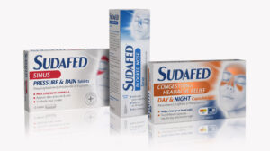
1HQ was briefed to introduce the new Head Cold range, across global markets, with eye-catching graphic design and better packaging architecture.

We needed to redefine the decongestant category by launching a new proposition that targeted the ‘Head Cold’. This would mean reassessing the current architecture and consolidating the product portfolio into three pillars.
We had to carefully tread the tightrope, balancing the specific needs of each local market with the requirement to create more visual consistency across the global brand.
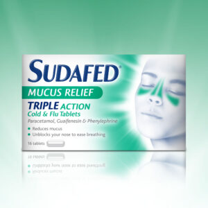
Undeterred by this tricky challenge, we first developed the iconic Sudafed head device with a three-quarter view. This allowed us to clearly signpost key areas of symptomatic relief to make it easier to understand the product proposition and navigate the range.
Using the new product architecture, we developed a clear sub-branding strategy for the range with different messaging and on-pack claims for each of the pillars. This approach formed the foundation of the new packaging design.
But there were also more tangible results: the new branding led to Sudafed being introduced into a number of additional international markets. At the same time, it also prompted a 19.5% YOY increase in profitability in one established overseas market.